My tips on creating infographics.
I think templates can make the creation of infographics easier because they provide predefined layouts and design elements that I can modify as needed. However, using templates can limit the degree of customization, so it may be necessary to maintain some creative freedom while meeting needs. On the other hand, templates can speed up the creation process, making it more efficient. Secondly, the design principles of an infographic depend on the nature of the message and the target audience.
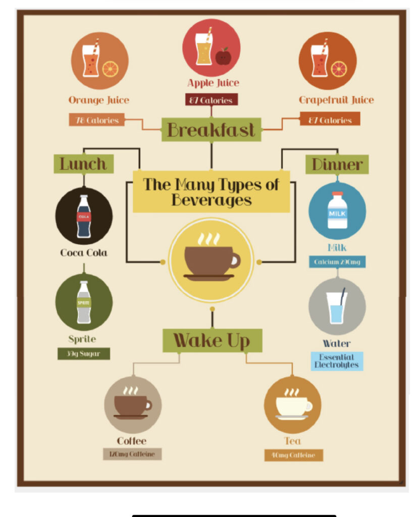
The infographic I created about beverages was designed to allow people to choose what they can drink at different times of the day when they see it. Of course, I made use of the template, which has clear and crisp images and simple images with uniform colors that are consistent with the chosen style. I think it allows the people viewing it to understand what I am trying to convey.
What does inclusive design mean to you?
I consider inclusive design to be a design philosophy that seeks to ensure that a product, service, environment, or system is accessible and usable for all people, regardless of their abilities, needs, or backgrounds. The goal of this design approach is to eliminate discrimination, exclusion, and inequality so that as many people as possible can participate and benefit.
When I run the WAVE accessibility report.
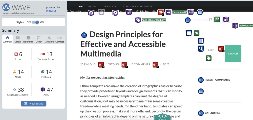
WAVE identifies informational elements in a document, such as headings, lists, links, etc., to help us understand the structure of the page.
It will also report accessibility errors and warnings that are usually found on a web page.
In the future, if WAVE accessibility reports were run on blog posts, a feedback mechanism could be created so that readers could report accessibility issues and then improve and fix them.

Recent Comments